Bike Maryland
Redesigned the local bicycle club website, Bike Maryland, to improve clarity, usability, and access to key information for all users.
My Role:
UI/UX Designer
Interaction Designer
User Researcher
Tools:
Figma
Adobe XD
Miro
The Problem?
The Bike Maryland Club is a local bicycle organization that hosts events, shares tips, and provides resources for cyclists, but its outdated website made it difficult for users of all backgrounds and ages to find useful information. The homepage lacked a clear mission, upcoming events were hard to locate, and the weblog appeared disorganized, creating a frustrating experience. Recognizing these challenges, the team set out to redesign the site to make information easier to access and create a more engaging and user friendly experience overall.
As Bike Maryland was an established bike club, we opted not to conduct surveys. Instead, we conducted 4 phone interviews with target users to gather qualitative research. Our questioning was focused on understanding the needs and wants of avid bike riders when it comes to bike clubs.
Research
"I like to bike more often, but safety concern hold me back. "
Interviews
"I Use cycling as transportation two times a week."
"I prefer cycling in a group and it's hard to find groups or events."
"I would want to learn more about safety for my kids."
"I need more information about routes and trails."
Interviews with members of the Maryland cycling community revealed several shared needs and challenges that impact how often and how confidently people ride. While many participants expressed strong interest in biking regularly, gaps in safety resources, community visibility, and accessible information made the experience feel less supportive. These insights helped guide the redesign toward a more user centered and community focused experience.
Key Insights:
Riders want clearer and more accessible safety information, especially for families and children.
Many users are interested in biking more often but feel held back by safety concerns.
Cyclists are actively looking for reliable routes, trails, and local riding resources.
Group riding is preferred by many, yet finding events and cycling communities is difficult.
Some users rely on biking for transportation, highlighting the need for practical, up to date information.
Persona
Based on patterns identified in the research, Larry Rider was created to represent environmentally conscious, community focused cyclists who rely on biking for transportation and personal values but face ongoing barriers.
He reflects users who want to stay informed, feel safer on the road, and become more involved in local advocacy and group riding, helping guide more empathetic and user centered design decisions.

Using Larry’s goals and pain points as a guide, the design moved into low fidelity sketching to explore layouts that prioritize accessibility, community engagement, and clear navigation. These early concepts focused on surfacing the most relevant content while creating a consistent experience across desktop and mobile platforms.
Sketches
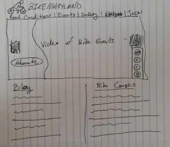
Event carousel highlighting upcoming bike events and community activities.
Dedicated sections for bike courses and educational resources.
Organized blog area for news, tips, and advocacy updates.
Visual layout designed to support scanning and easy content discovery.
Quick access icons for navigation and engagement tools.
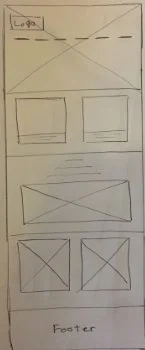
Vertical layout optimized for one handed browsing.
Prominent events section for quick discovery.
Simplified blog feed for on the go reading.
Accessible bike courses section with clear navigation.
Streamlined footer for essential links and resources.
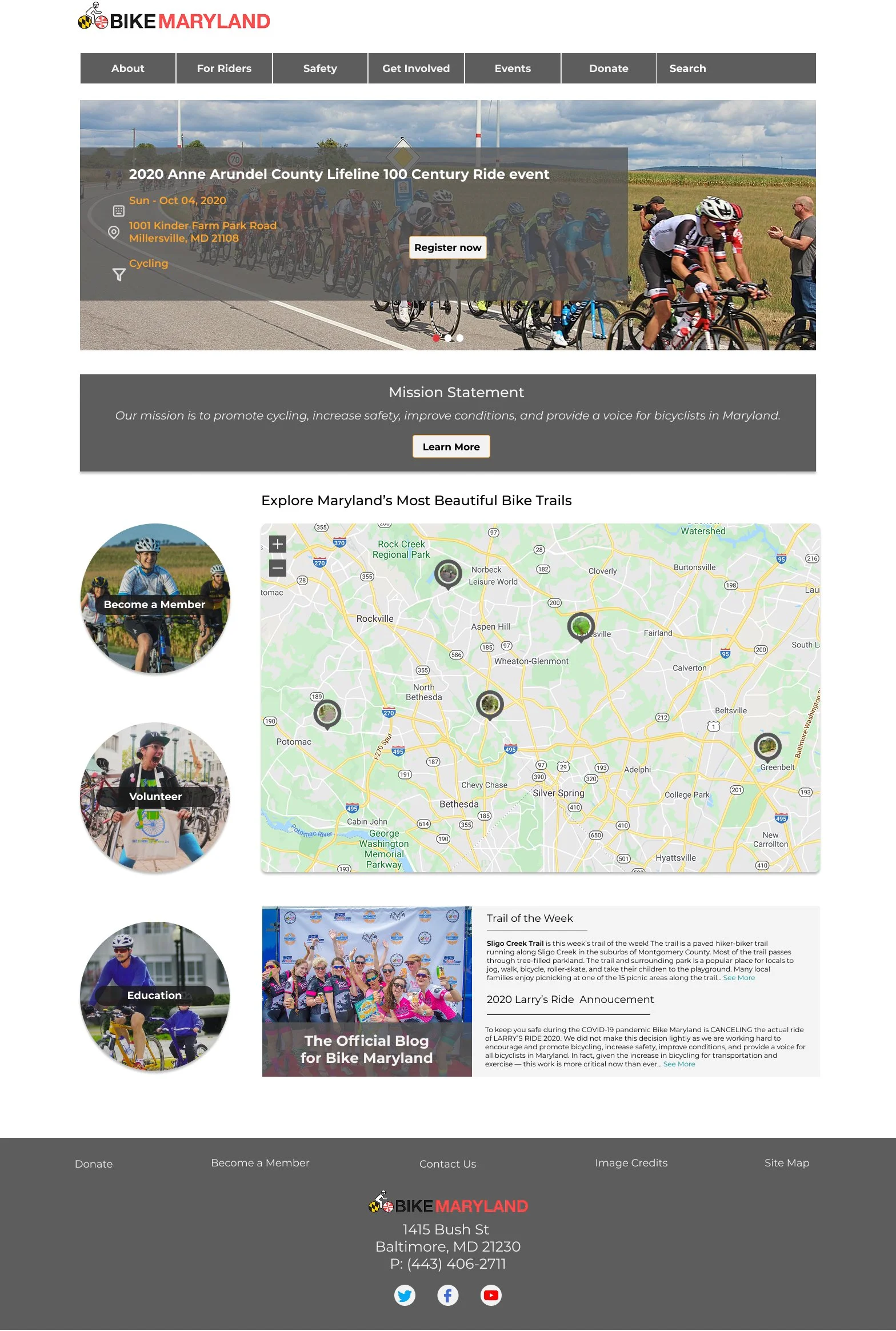
Using the structure and priorities from the sketches, the design was refined into a high fidelity prototype that feels more polished, intuitive, and easy to navigate. This final version focuses on making key information more visible while creating a welcoming experience for both new and returning users.
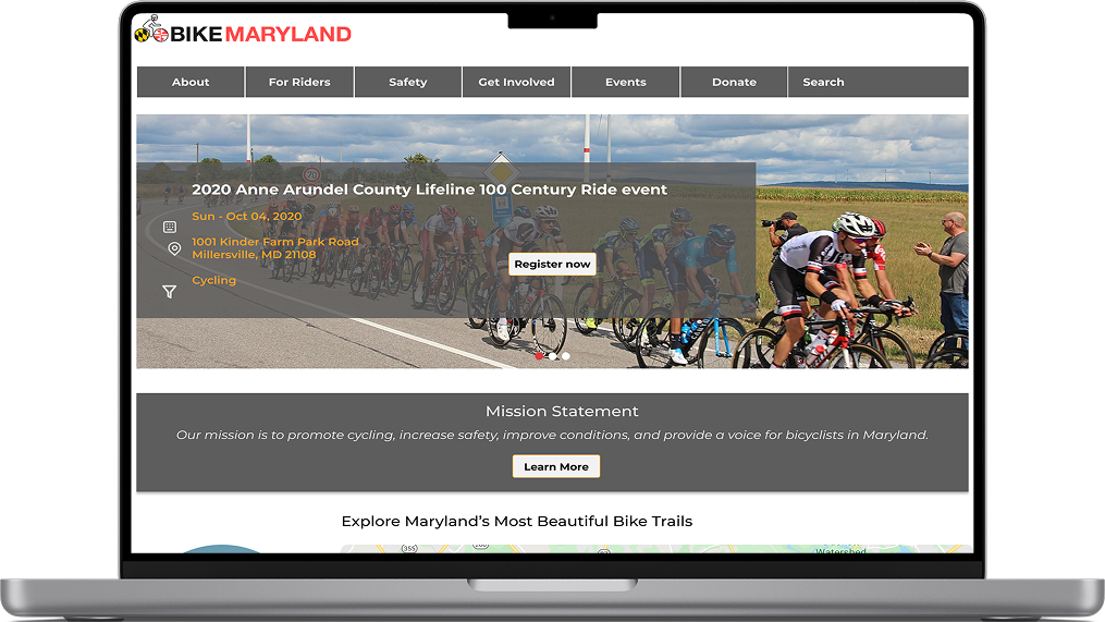
Final Product (Desktop)
A clean navigation bar that highlights the most important sections, including events, safety, and ways to get involved.
A rotating hero carousel that features major cycling events and encourages users to become members.
A clearly placed mission statement that helps users quickly understand Bike Maryland’s purpose.
High quality imagery that reflects the local cycling community and builds engagement.
A clear visual hierarchy that makes it easier to scan the page and find relevant content.
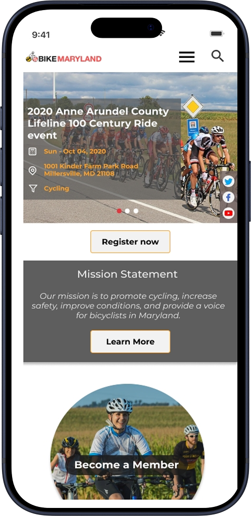
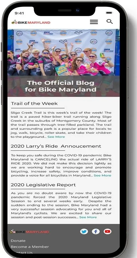
Final Product (Mobile)
An interactive map that helps users explore nearby trails and bike friendly routes.
Location based markers that make it easy to discover popular riding spots.
A mobile friendly blog layout for reading articles, announcements, and safety updates.
Clear call to action buttons that encourage users to learn more and get involved.
Consistent branding and navigation for a seamless transition between desktop and mobile.
For the Future:
In the future, we aim to create a “Donate” page that encourages greater interaction and engagement from users. We plan to develop a primary version of the page that can be tested and refined with a larger user base, allowing us to iterate based on real feedback. Additionally, we hope to incorporate subtle interactive animations to enhance the user experience and make the page more engaging. Through these efforts, we seek to build a more impactful, user centered platform that better serves our community.