Austin & Elkins
This project focuses on redesigning the website for Austin & Elkins, a well-established jewelry company based in Alexandria. The goal was to create a more modern, responsive experience that reflects their brand, craftsmanship, and growing younger audience.
My Role:
UI/UX Designer
Interaction Designer
User Researcher
Tools:
Figma
Adobe XD
Miro
The Problem?
Austin & Elkins is a well-respected and established Alexandria-based jewelry company. Being around for the past 30 years has allowed them to maintain a solid client base, but there has been an increase in business with a younger generation. With this new growing client base and the pandemic, Austin & Elkins realized their website was unresponsive and did not reflect their business’ branding or their high-quality presentation standards.
Research
Right away, we scheduled a meeting with Robin not only to set up times frames and define deliverables, but to also take the time to get to know her, her business, and her goals for this project a little better.
Key Findings
Personal experience for the users.
Clear explanation of custom design process.
Details about the jewelry.
Likes
Dislikes
Inaccurate photos of the jewelry.
Text-heavy sites.
Poor time estimates.
Confusing navigation items.
Needs
These findings show that Robin values creating a personal, trustworthy experience for her customers, with clear communication around custom designs and craftsmanship. She was looking for a website that feels unique, easy to navigate, and visually accurate, while avoiding clutter and confusion that could weaken user trust.
Trustworthy jeweler.
A unique website that draws users.
A site that is easy to navigate.
Persona
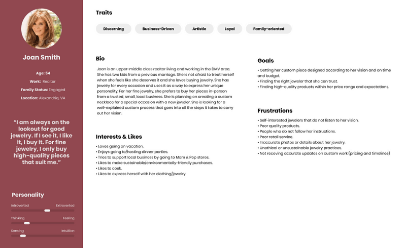
Building on these insights, we developed a primary user persona to represent Robin’s ideal customer and guide our design decisions. Joan reflects the needs, motivations, and expectations uncovered through our research.
Key Highlights of Joan:
54-year-old, family-oriented professional who values quality and trust.
Loyal customer who prioritizes craftsmanship and custom design.
Enjoys in-person experiences and personalized service.
Looks for clear communication, realistic timelines, and transparency.
Frustrated by poor responsiveness and lack of attention to her vision.
Prefers a simple, organized website that supports confident purchasing.
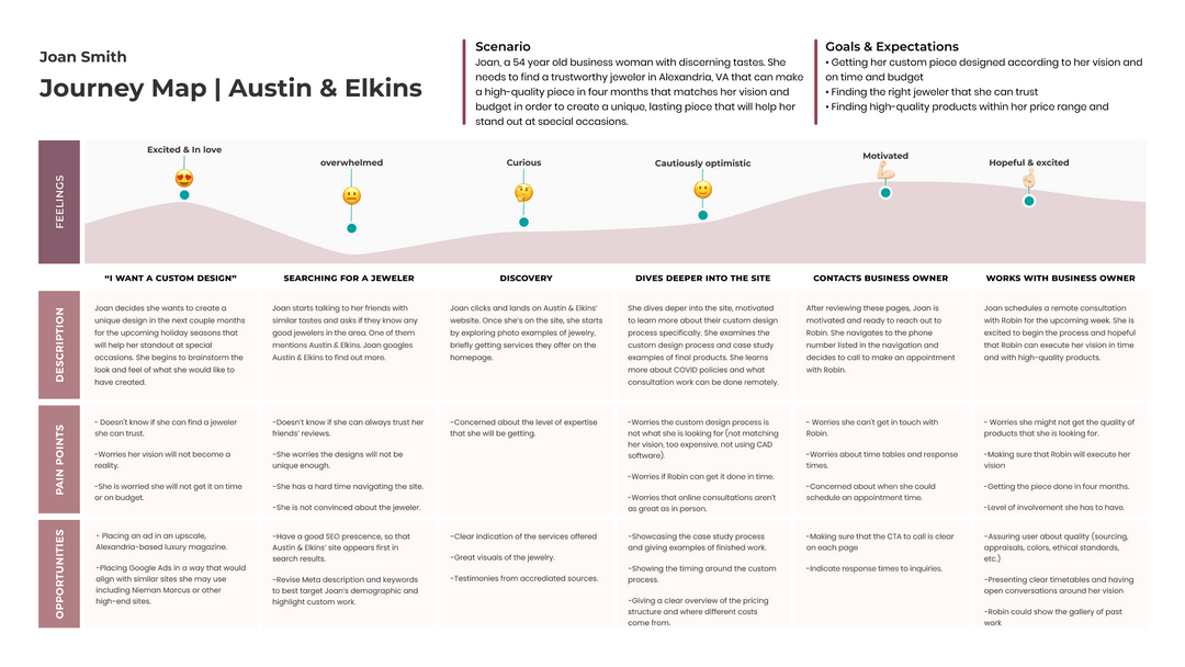
Journey Map
To better understand Joan’s full experience, we created a journey map that outlines her emotions, actions, and pain points from initial interest to final purchase. This helped us identify key moments where the website could better support her needs and build trust.
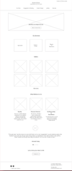
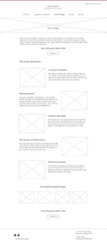
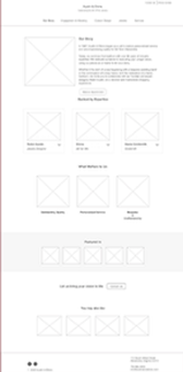
Wireframes
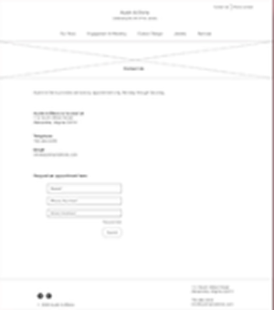
Using insights from the journey map, we translated user needs into early design concepts through collaborative sketching. Each team member explored different page layouts and features, which were then refined into a low-fidelity wireframe that I created and tested with five users.
User Testing
To validate our design decisions, we conducted usability testing on the wireframes and gathered valuable feedback to guide refinement. These insights helped us balance user needs with the client’s vision for a clean, simple, and elegant experience.
Key User Testing Insights:
Multiple CTAs per page felt overwhelming and overly pushy.
Homepage hierarchy needed improvement to better highlight brand values.
The “Jewelry” page title was confusing since it functioned only as a gallery.
Users wanted clearer navigation and stronger visual focus.
Feedback guided the transition into a polished, high-fidelity prototype.
Final Product: Desktop
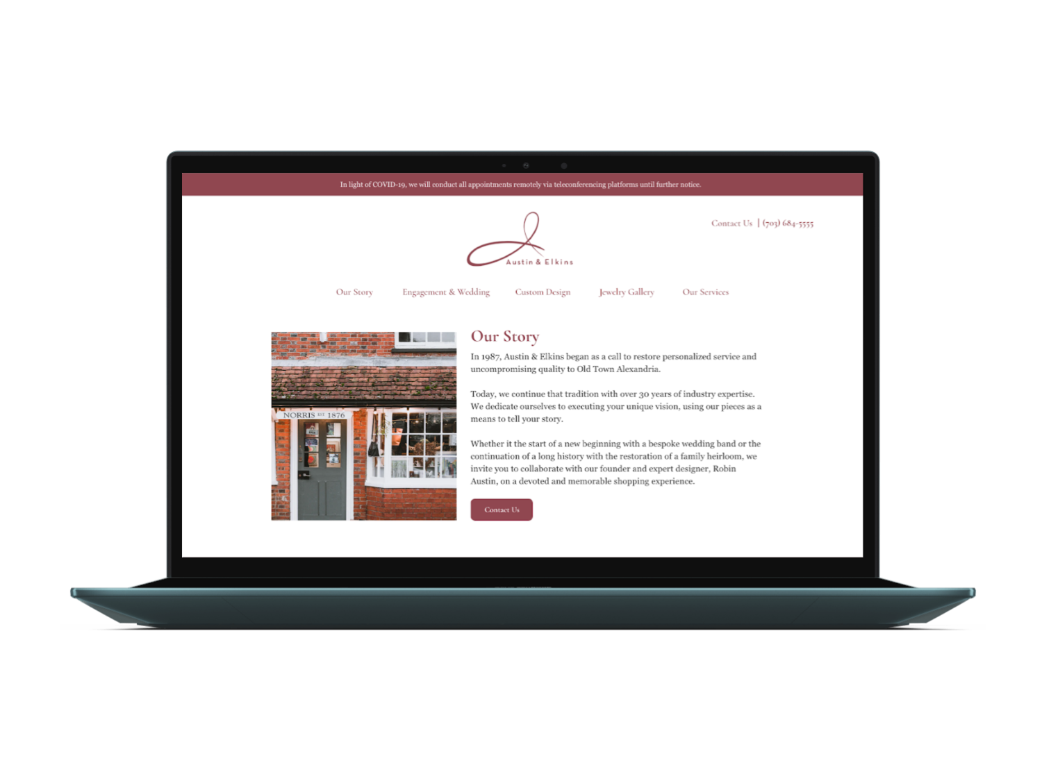
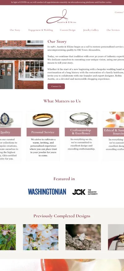
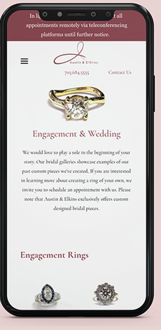
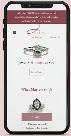
Based on user feedback and usability testing, the final design focused on improving clarity, accessibility, and visual consistency across the site.
Key Improvements and Features:
Improved visibility and readability of important notices, including the COVID-19 update.
Renamed and clarified the “Gallery” navigation item to reduce confusion.
Increased overall font size to enhance accessibility and readability.
Established consistent styling for buttons, cards, and UI components.
Strengthened visual hierarchy to better highlight key brand sections.
Created a cleaner, more cohesive layout that reflects Austin & Elkins’ elegant identity.
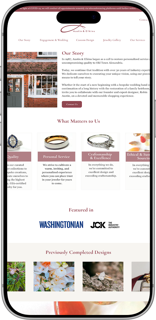
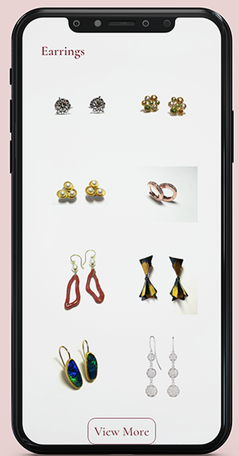
Final Product: Mobile
For the Future:
Having direct insight from the client was essential in shaping our design decisions and ensuring the final product aligned with her vision and goals. By balancing these insights with user research, we were able to advocate for users while creating solutions that supported the business. Completing the project within a tight timeline strengthened my design process and reinforced the importance of collaboration and iteration.
If given the opportunity to continue this project, our team would focus on:
Expanding the galleries with more jewelry images.
Adding detailed information for each product.
Introducing more interactive features to enhance engagement.
